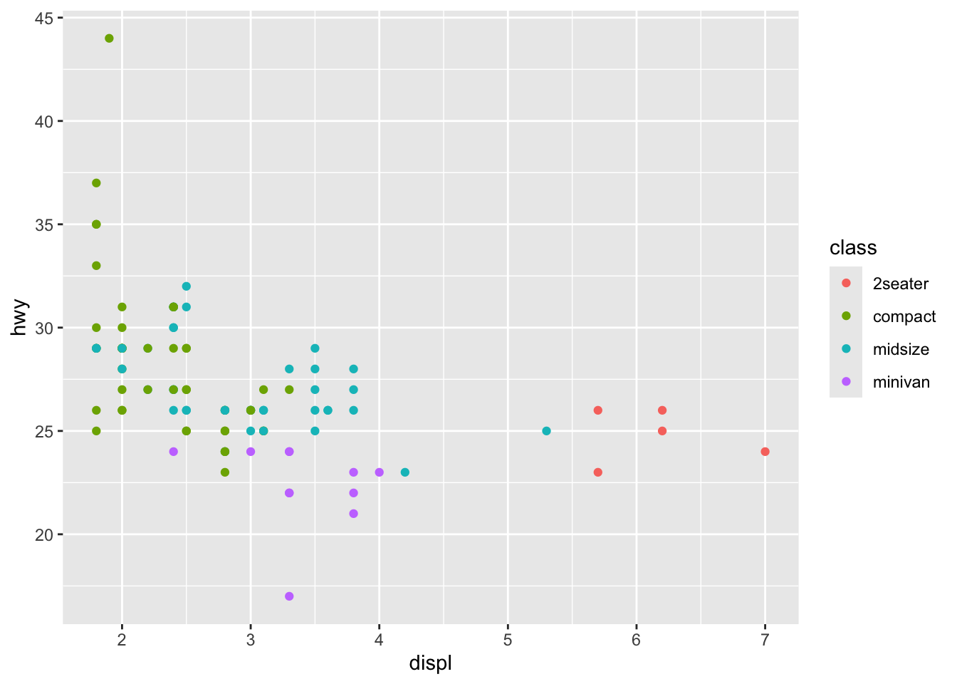

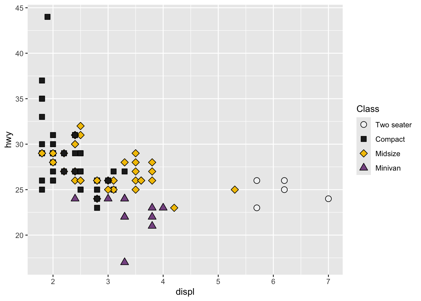
In R, I use ggplot2 for most of my plotting needs, but I’m not exactly in love with its default plotting aesthetics. Over time I developed a particular taste for how I like my plots for presentations or publications. It requires a bit of tinkering around to take creative control over gg-plots. Check out the two scatter plots below.
One of these plots is better than the other one, and it’s not the first one.
This book has guided me through the logic of what makes a plot “good” vs. “bad”. In this blog, I’ll break down the second plot into three parts. This could be adapted to a PCA plot for instance.
ggplot(mpg[mpg$class %in% c("compact","2seater","midsize","minivan"),], aes(displ, hwy))+
  geom_point(aes(fill=class, shape=class), size=3, color = "black")+
  scale_fill_manual("Class",
                    values = kelly()[1:4])+
  scale_shape_manual("Class",
                     values = c(21:24))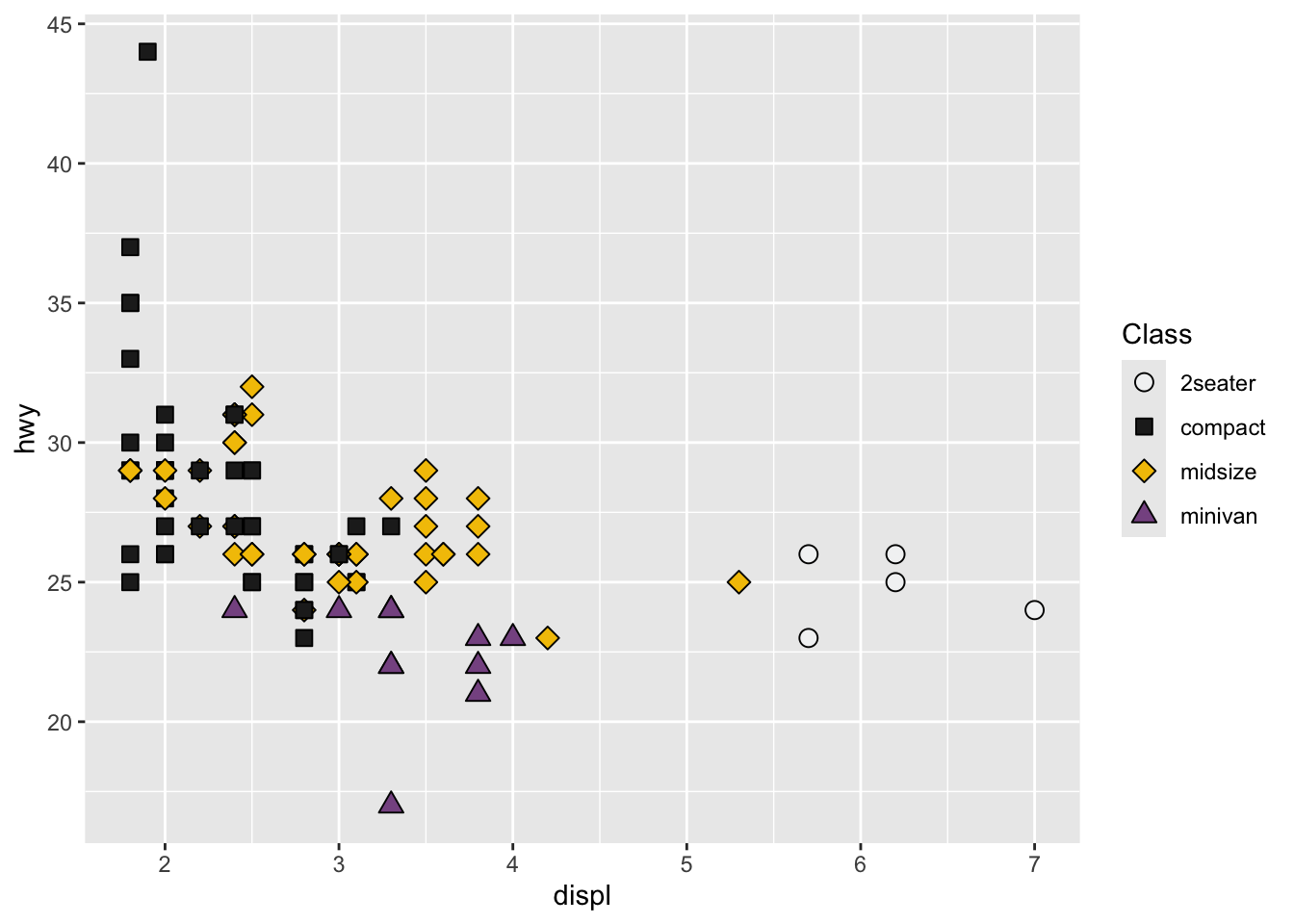
I’m a big fan of using both shape and colour. This could be considered redundant, but I like the extra layer of separation between groups. aes(fill=class, shape=class) tells ggplot2 that “class” should be used as a variable to fill and shape points differently. Their respective scale_*_manual() specify which shapes or fill colours are available. Values 21 to 25 are available as empty shapes that can be filled with… fill. labels and breaks can be used to map different labels to each item (in this case under “class”) on the fly without changing the underlying data. These options should be identical across both scale_*_manual() or else two different legends could be shown.
  scale_fill_manual("Class",
                    values = kelly()[1:4],
                    labels = c("Two seater", "Compact", "Midsize", "Minivan"),
                    breaks = c("2seater", "compact", "midsize", "minivan"))+
  scale_shape_manual("Class",
                     values = c(21:24),
                    labels = c("Two seater", "Compact", "Midsize", "Minivan"),
                    breaks = c("2seater", "compact", "midsize", "minivan"))
I picked the first four colours in kelly under pals. This is a nice discrete scale with a good range of choices.

These labels can be changed on the fly with xlab and ylab.
The rest comes from theme(). There are a ton of options, but only a few are relevant to me.
theme_bw()+ # gets rid of grey background in the plot area
theme(
      # grid lines can be controversial, in my field it's not seen often
      panel.grid.minor=element_blank(),
      panel.grid.major=element_blank(),
      axis.text = element_text(color="black",size=14), # default font size is too small
      axis.ticks = element_line(colour="black"), # just plain old black please
      axis.title = element_text(size=14), # default font size is too small
      legend.title=element_text(size=14, vjust=0.5, hjust=0.5),
      legend.text=element_text(size=14, vjust=0.5, hjust=0),
      plot.margin=unit(c(1,1,1,1),"cm"),
      plot.background=element_rect(fill="transparent", colour=NA),
      panel.border = element_rect(colour="black"), # I like to draw a crisp border
      panel.background=element_rect(fill="transparent", colour=NA),
      legend.background=element_rect(fill="transparent", colour=NA),
      legend.box.background=element_rect(fill="transparent", colour=NA),
      legend.key=element_rect(fill="transparent", colour=NA),
      legend.position = 'right',
      aspect.ratio=1) # I like it to be square
One thing I’m not certain about is the role of fill="transparent", colour=NA. Those are meant to disable bakground colour, but it can depend on how the plot is saved I think (ex. ggsave(), pdf(), png(), etc). So those could be redundant/pointless.
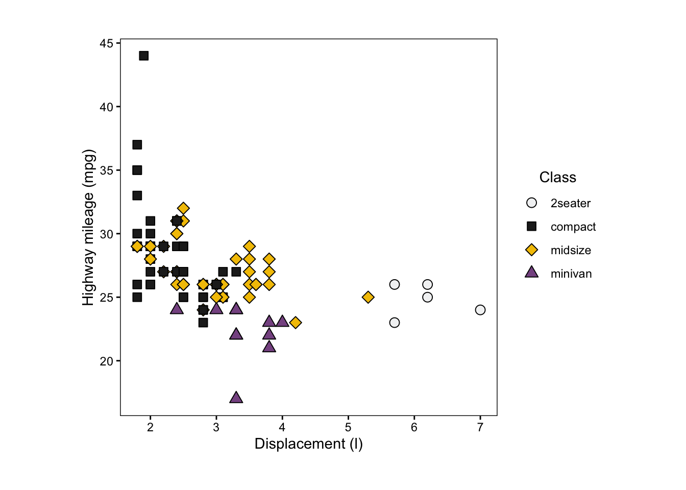
I see this “problem” often where the text is too damn small. The final output size of the plot is also crucial. If this plot was saved as a 6’ by 6’ wall mural, point 14 font will not help with the cause. Instead, saving as a few inches tall/wide then scaling up (as vector graphics hopefully) would preserve the relative sizes between text, lines and points.
\ (•◡•) /